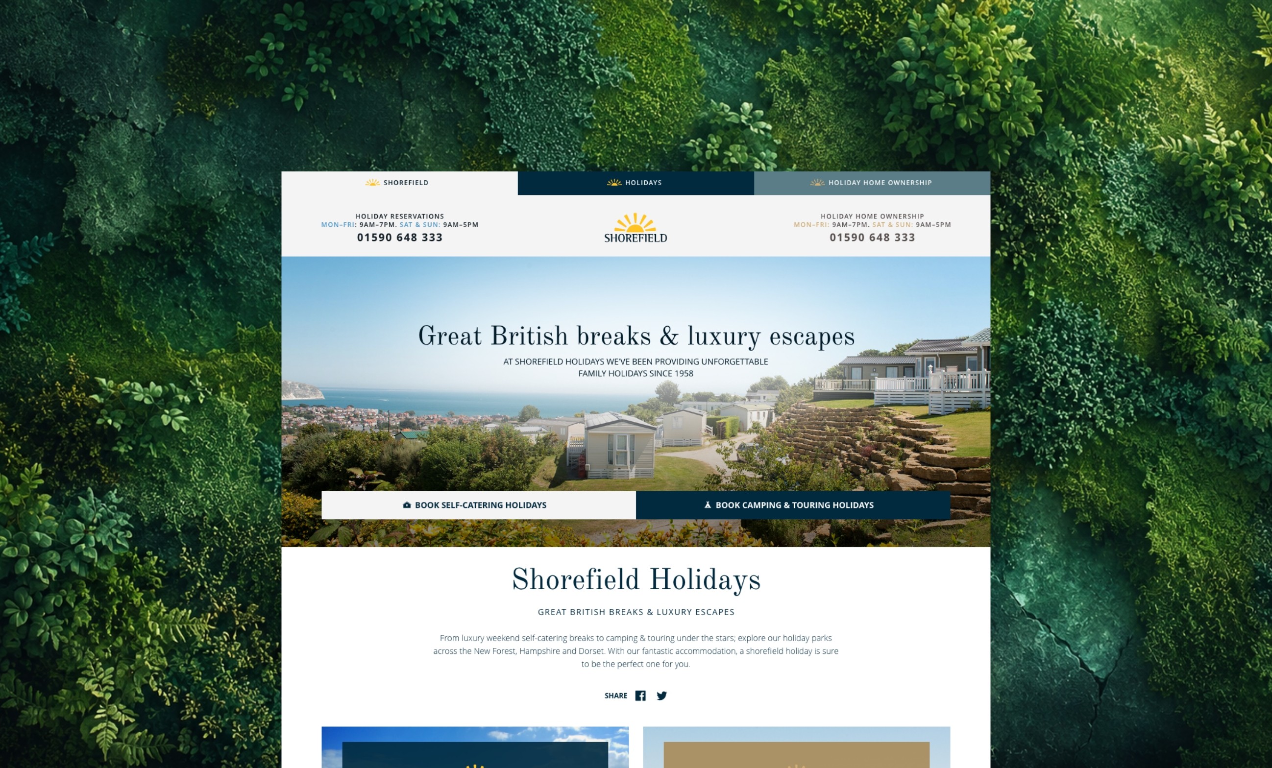
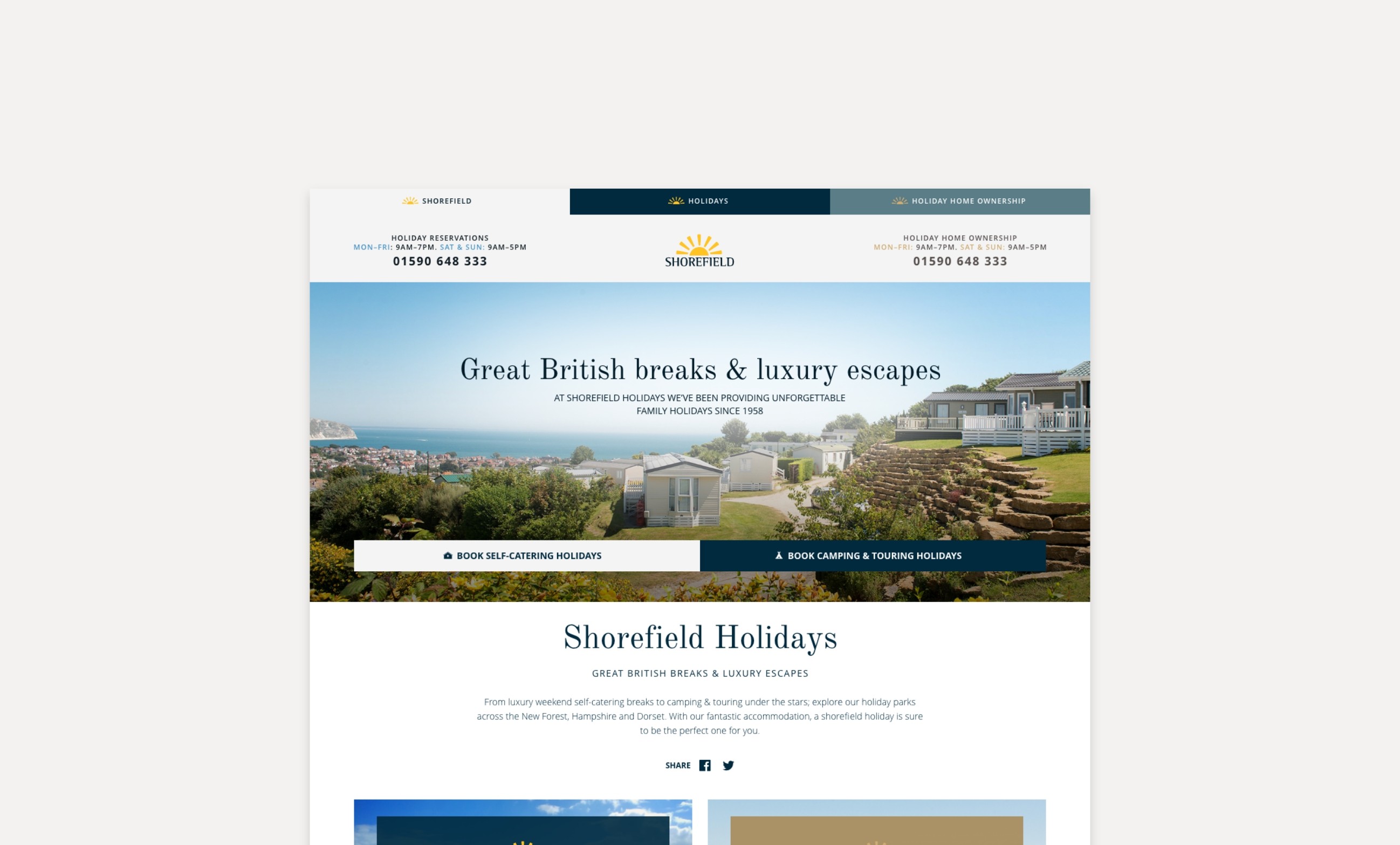
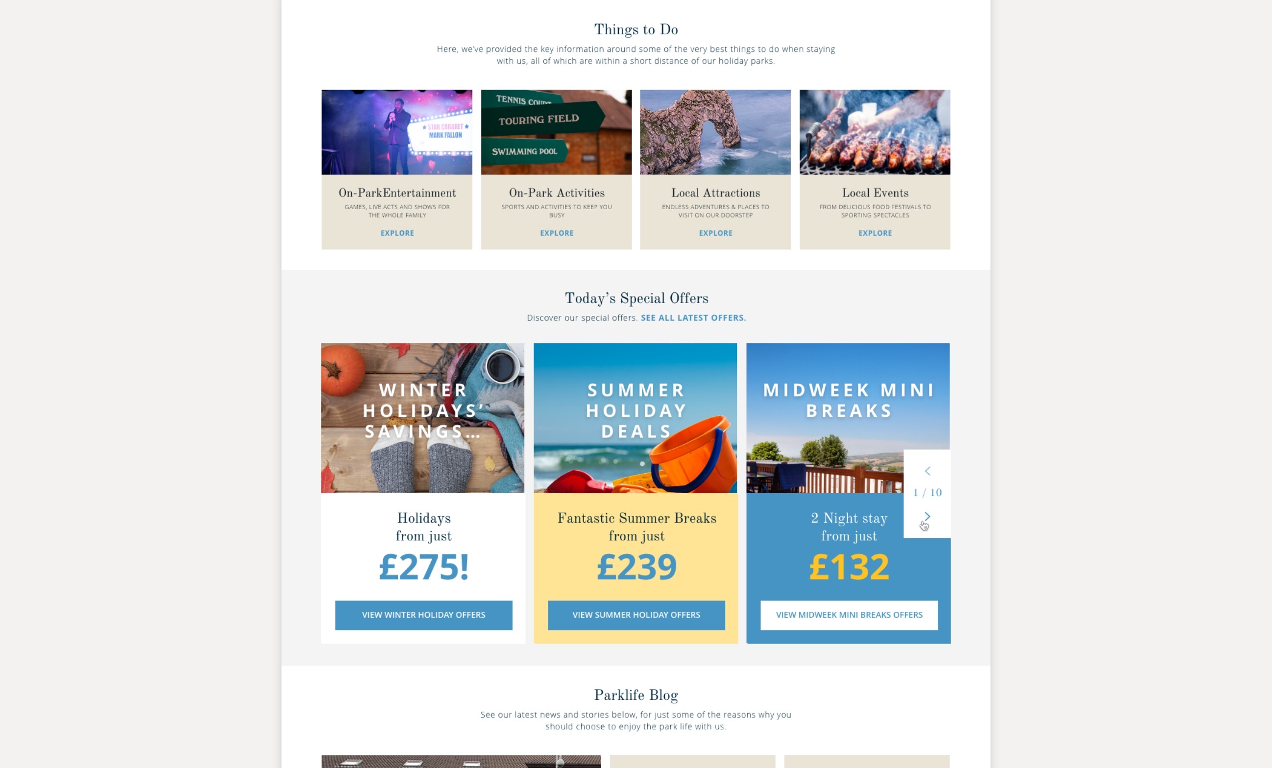
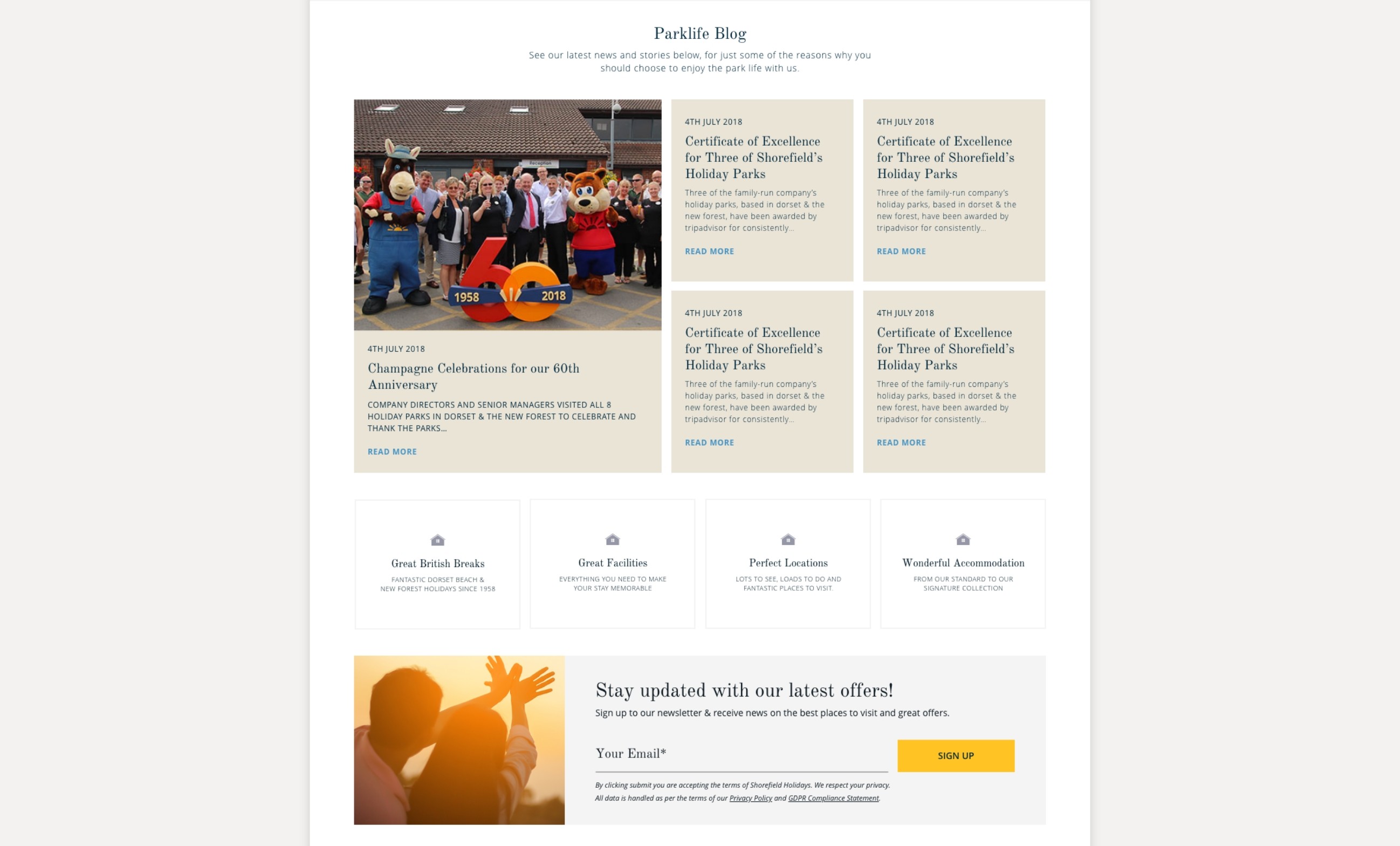
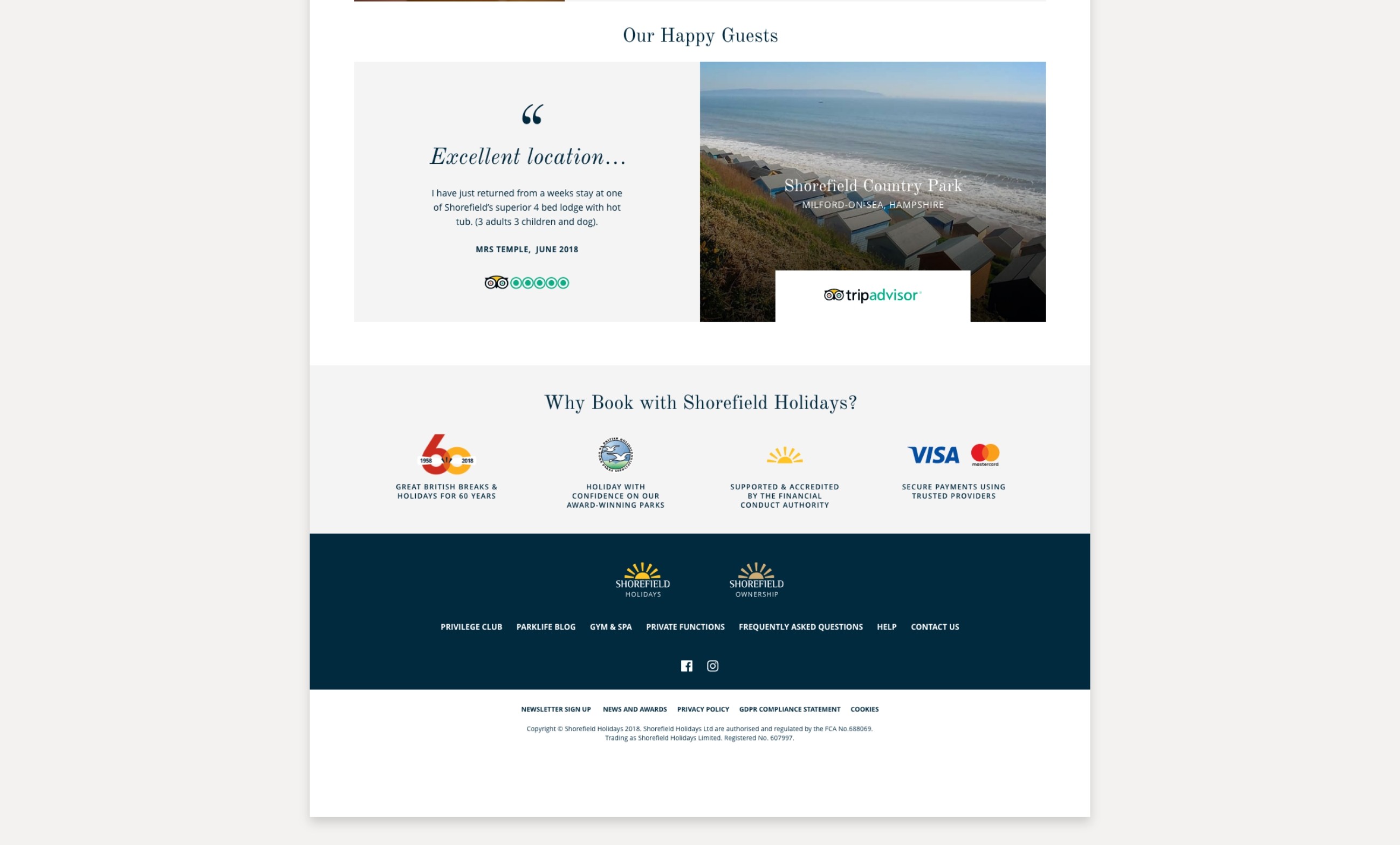
A full website redesign for Shorefield Holidays, creating a clearer digital experience across holiday bookings, ownership enquiries and brand content.
Project details
Client: Shorefield Holidays
Sector: Travel, Leisure, Holiday Parks
Role: UX/UI Design, Website Redesign, Design System Direction
Focus: Booking journeys, content structure, visual identity, responsive design
Overview
Shorefield Holidays needed a redesigned website that could serve two very different audiences: people looking to book a holiday and people considering holiday home ownership.
The challenge was to create clear separation between these journeys without making the site feel fragmented. The new design introduced stronger visual hierarchy, cleaner content modules, improved navigation, more intentional use of photography and a flexible design system that could scale across parks, accommodation, activities, ownership and brand content.
The challenge
The existing website had become content-heavy and visually rigid. Important holiday inspiration, park information and ownership messaging were competing for attention, making it harder for users to quickly understand where to go next.
The brief called for a site that felt more premium, easier to scan and more emotionally engaging, while still supporting practical tasks like browsing parks, comparing accommodation and moving users towards booking or enquiry.
My approach
My approach
I redesigned the experience around three clear content areas:
Holidays
Focused on inspiration, park discovery, accommodation and online booking.
Ownership
A more premium, lead-generation journey designed to sell the lifestyle and encourage enquiries.
Generic brand content
A flexible area for homepage content, spa, blog, about pages and wider Shorefield messaging.
Across the site, I used consistent typography, spacing, components and grid structure to keep the experience connected, while allowing each section to have its own visual personality.
Design direction
The redesign moved away from heavy blocks of copy and introduced a more editorial, image-led approach.
Large photography, generous white space, refined typography and clear call-to-action areas helped create a softer, more aspirational holiday experience. Content was broken into shorter sections, benefits, highlights and scannable modules to help users make decisions faster.
Key improvements
Clearer separation between holiday booking and ownership journeys
More premium use of photography and video areas
Improved navigation and content discovery
Stronger CTAs across booking and enquiry paths
Reusable components for parks, accommodation and activities
Responsive layouts built around consistent image ratios and grid behaviour
A calmer, more spacious visual system with stronger hierarchy
Outcome
The final redesign created a more modern, flexible and conversion-focused website experience for Shorefield Holidays.
It balanced inspiration with usability, helping users explore holidays, understand the parks, discover activities and move confidently towards either booking a stay or enquiring about ownership.